
Overview
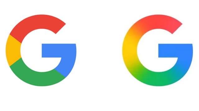
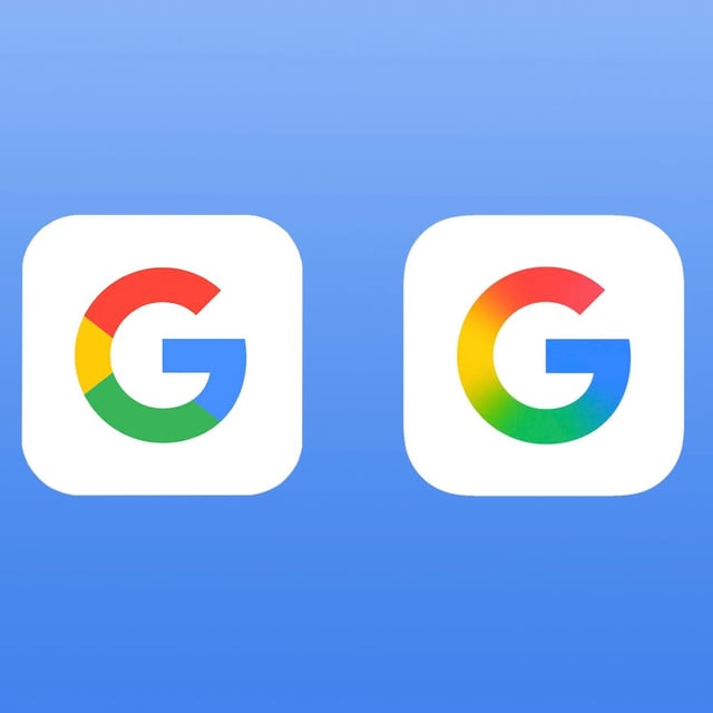
- Google has redesigned its 'G' logo for the first time since 2015, replacing sharp color divisions with seamless gradients.
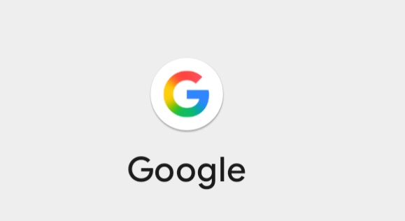
- The updated logo is now live on the Google Search app for iOS and Android beta (Pixel) devices, while the older version remains on most Android and web platforms.
- The redesign retains the same four colors—red, yellow, green, and blue—and the letter 'G' but introduces a smoother, more modern aesthetic.
- This visual update reflects Google's broader focus on AI, as the gradient mirrors the branding of its Gemini AI products.
- The full Google wordmark logo remains unchanged, ensuring continuity in brand recognition across platforms.