

Overview
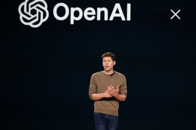
- OpenAI revealed a new logo design, a large black 'O,' during a recent company-wide meeting.
- The new logo contrasts sharply with the current hexagonal flower symbol, which represents 'precision, potential, and optimism.'
- Employees expressed strong disapproval, describing the new logo as 'ominous' and lacking in creativity.
- The redesign is part of a larger overhaul that includes changes to OpenAI's corporate structure and a focus on revenue and investors.
- The final logo design is expected to be revealed next year, with potential changes based on employee feedback.